Thursday, April 13, 2017

Mark Carder's Color Palette (DrawMixPaint)


        I accidentally stumbled across Mark Carder’s YouTube video channel DrawMixPaint in November 2015. At that time, I was heavily confused over my skills and felt that I reached the dead-end. It was like a boon for me to find http://www.drawmixpaint.com/; Mark’s instructions aimed at all the things that I was struggling with at that time.

      Previously, I was under the influence of a group of artists who paint oil paintings like pastels with bright colors all around and have no connection with reality. I do not call these Impressionism because the real Impressionists painted the best pictures that are full of life and spirit. I was seeing and painting the natural colors but convinced myself (due to the influence of the aforementioned artists) that I was doing something wrong and against the trend. This conflict was beginning to destroy my own joy of painting. But after finding Mark, I understood that there was nothing wrong with my eyes and came across a large number of great artists worldwide who paint realism. They see natural colors and use the learning of both Impressionism and previous ages.

Mark Carder explaining the values and colors that he mixed and matched for his portrait demo.
 
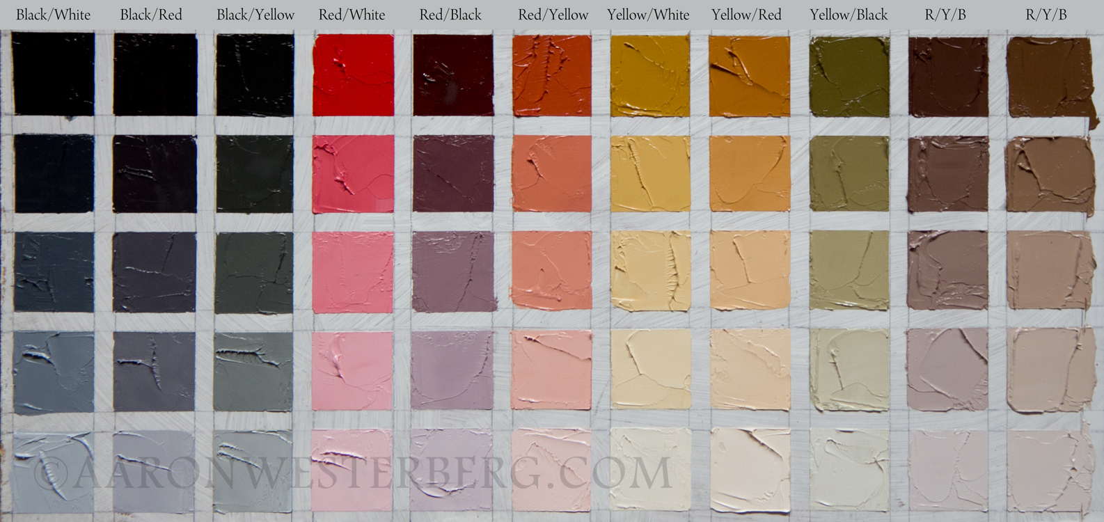
     One of the most important factors that Mark Carder addressed was his use of ultra-limited color palette for natural colors instead of a big color palette. Before 2014, I used only the color that I felt I needed in a painting, which resulted in chaos. In 2014, I moved towards split primary colors (Titanium White, Cadmium Yellow Deep, Cadmium Lemon Yellow, Cadmium Red Light, Alizarin Crimson, Ultramarine and Prussian Blue). However, this also became difficult to maintain as acquiring all these colors became very expensive. Some of them were Series 4 and similar Hue colors were not that brilliant. So, I needed something new and stable.

     Mark’s palette has only five colors: Titanium White (White); Cadmium Yellow/ Cadmium Yellow Light Pale (yellow); Pyrrol Rubine/Permanent Alizarin Crimson/Permanent Madder Deep in Rembrandt (red); Burnt Umber (Brown) and French Ultramarine (Blue). So, it minimized the cost beyond measure. It has two warm/cool lightening/darkening color and mixing can be done totally according to Mark’s simplified color mixing chart. Only addition to the primaries is Burnt Umber, which really is the workhorse of this palette. It saves other expensive colors, maintains warmth, prevents bluish milkiness and creates a dark orange base.

     Mark justifies that any natural colors (except brightest oranges, purples and blue-greens) can be mixed and matched with this palette provided the painting is painted under the same brightness of light as the subject. Mark's color mixing chart below is very simple and self explanatory. This theory simplifies all sorts of confusion regarding mixing. E.g. if the color has become more blue-green compared to the subject, then add the opposite color brown to normalize it. If green is too yellowish as compared to the subject, then add purple to diffuse the yellow in the green. I used this theory and it works very beautifully. It has reduced all my previous efforts to the minimum.


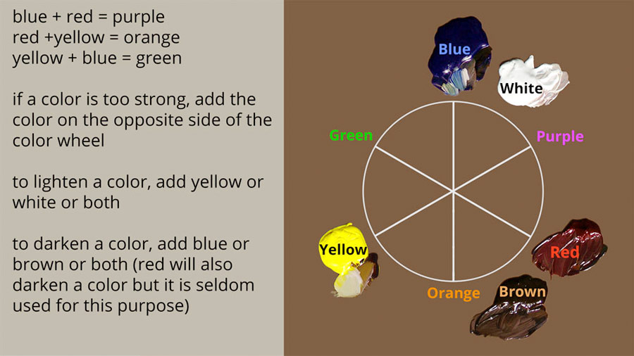
     When you reach a point where you cannot match a color with this palette, you can use auxiliary powerful colors such as Pthalo Blue, Cadmium Scarlet/Orange and bright purples. In that way both cost and effort to manipulate these powerful colors will be minimum. 

     It is important to mention that Mark recommends mixing clove oil and stand oil to oil paints, which leaves the paint wet for a longer period which is again a trend breaker in the industry as the most manufacturers and artists opt for quicker drying time. They think that slow drying is a problem. It is easier to manipulate wet paint rather than painting wet-on-dry. This theory helped me again a great deal in improving my art. I used to wait for my paints to dry to correct mistakes; now I don't. 

    I hope this blog helps the reader to make his/her painting process smoother like wet paint 😀. Many people won't believe that such a limited palette is of any use. But I feel that it is better to try and then believe.

Wednesday, January 11, 2017

How to or not to Judge Art; Abstract Expressionism Paintings by Kaustav Mukherjee


Personal preference or taste cannot be a parameter to judge art (good or bad), especially without the experience of looking at vast types of artwork. Ability to judge art is a summation of understanding the techniques employed, culture of a time, experience of ones life, feelings etc. Art can only be understood objectively - the artist's aim. Without this understanding, nobody can differentiate between good art and bad art.

Here I must point out that people generally despise modern art due to lack of understanding of the concept. The viewers do not understand that the modern art is more to do with instincts and feelings that can only be felt or experienced. It is not representational. That said, a question can be asked that how many people really even understand representational art? Do they have enough knowledge to understand the symbolism in a representational painting? Rembrandt's 'Return of the Prodigal Son' may look just an ordinary painting to a lot of people unless they are shown what aspects to look at. However, one must know that lack of skills cannot be an excuse to get into modern art just because it looks easier sometimes and leave representational art totally since there is a problem to handle called the 'likeness' in it. Modern art is not at all easy. Years go by just to find the most desired style of painting that connect to the senses of both artist and viewer.

Thursday, October 27, 2016

Zorn Palette: An Extraordinary Experience

Anders Zorn (18 February 1860 – 22 August 1920)


      Anders Zorn is known to have used a primary color palette consisting of Lead White (Flake White), Yellow Ochre, Vermilion and Ivory Black. Surprisingly, this ultra-limited palette can produce a vast range of mixes. These days this color palette of Anders Zorn is receiving praise due to the enormous possibilities it provides. It is also noteworthy that three out of the four colors are Series 1 (the cheapest).


     Artists these days consider this palette as a very important development for oil painting and portraiture in particular. However, it is noteworthy that these colors can also be used in still life and landscape paintings under certain circumstances. Most striking aspect is that a kind of an olive green color is possible to obtain by mixing Ivory Black and Yellow Ochre as Ivory Black is bluish in nature. Observe the examples below:

Zorn Palette Still Life by Kaustav Mukherjee
Zorn Palette Landscape by Kaustav Mukherjee


   The main reason for such choice of colors by Zorn is not certain but probably due to simplification of color mixing and availability of these colors anywhere in the world at that time. Also Lead White, Yellow Ochre, Vermilion and Ivory Black are perfect for any portraiture. It must be known to the reader that Anders Zorn was not the only user of this palette. But the palette received his name due to his display of extraordinary virtuosity with such limited range of colors.

    The color palette was not explored to the fullest during Zorn's time due to the advent of Impressionism, increased focus on colorful landscape painting and modern art, in which the artists preferred a much broader color range than a limited one. Also, Zorn palette cannot produce very bright colors such as sunny day greens, brightest oranges and pure purples. Thus it was less used by the artists. However, with the resurgence of realism in the recent times artists explored and found this to be an excellent choice for a number of reasons such as broader range, easy availability, lower cost and permanence of colors.

     Below is a study conducted by Aaron Westerberg in his blog 'Zorn Palette and Color Chart' Posted on 5/2/2016. The chart shows how wide the range of Zorn Palette is. 

https://fasoimages-4cde.kxcdn.com/11941/2054947xxl.jpg


     These days artists tend to use Cadmium Red Light and Titanium White in the place of Vermilion and Lead White respectively due to health and safety regulations and availability. This change also provides three new opportunities:
  • Brighter oranges and pinks due to more powerful Cadmium Red.
  • Although still very dull compared to pure blues, a 'Bluer' blue color due to blueish undertone of both Titanium White and Ivory Black
  • Palest tints due to powerful tinter Titanium White

     It is noteworthy in the end that there is misconception that Zorn used only these four colors. It is absolutely untrue. A large number of his paintings show the use of auxiliary colors (e.g. Viridian, Cobalt Blue etc.). He also had a large variety of colors in his possession. Therefore, he used these special colors only on need basis and used his regular colors for the majority of the work.