 |
| Anders Zorn (18 February 1860 – 22 August 1920) |
 Anders Zorn is known to have used a primary color palette consisting of Lead White
(Flake White), Yellow Ochre, Vermilion and Ivory Black. Surprisingly, this ultra-limited palette can produce a vast range of mixes. These days this color palette of Anders Zorn is receiving praise due to the enormous possibilities it provides. It is also noteworthy that three out of the four colors are Series 1 (the cheapest).
Anders Zorn is known to have used a primary color palette consisting of Lead White
(Flake White), Yellow Ochre, Vermilion and Ivory Black. Surprisingly, this ultra-limited palette can produce a vast range of mixes. These days this color palette of Anders Zorn is receiving praise due to the enormous possibilities it provides. It is also noteworthy that three out of the four colors are Series 1 (the cheapest). Artists these days consider this palette as a very important development for oil painting and portraiture in particular. However, it is noteworthy that these colors can also be used in still life and landscape paintings under certain circumstances. Most striking aspect is that a kind of an olive green color is possible to obtain by mixing Ivory Black and Yellow Ochre as Ivory Black is bluish in nature. Observe the examples below:
 |
| Zorn Palette Still Life by Kaustav Mukherjee |
 |
| Zorn Palette Landscape by Kaustav Mukherjee |
The main reason for such choice of colors by Zorn is not certain but probably due to simplification of color mixing and availability of these colors anywhere in the world at that time. Also Lead White, Yellow Ochre, Vermilion and Ivory Black are perfect for any portraiture. It must be known to the reader that Anders Zorn was not the only user of this palette. But the palette received his name due to his display of extraordinary virtuosity with such limited range of colors.
The color palette was not explored to the fullest during Zorn's time due to the advent of Impressionism, increased focus on colorful landscape painting and modern art, in which the artists preferred a much broader color range than a limited one. Also, Zorn palette cannot produce very bright colors such as sunny day greens, brightest oranges and pure purples. Thus it was less used by the artists. However, with the resurgence of realism in the recent times artists explored and found this to be an excellent choice for a number of reasons such as broader range, easy availability, lower cost and permanence of colors.
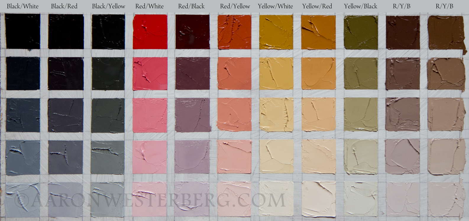
Below is a study conducted by Aaron Westerberg in his blog 'Zorn Palette and Color Chart'

These days artists tend to use Cadmium Red Light and Titanium White in the place of Vermilion and Lead White respectively due to health and safety regulations and availability. This change also provides three new opportunities:
- Brighter oranges and pinks due to more powerful Cadmium Red.
- Although still very dull compared to pure blues, a 'Bluer' blue color due to blueish undertone of both Titanium White and Ivory Black
- Palest tints due to powerful tinter Titanium White
It is noteworthy in the end that there is misconception that Zorn used only these four colors. It is absolutely untrue. A large number of his paintings show the use of auxiliary colors (e.g. Viridian, Cobalt Blue etc.). He also had a large variety of colors in his possession. Therefore, he used these special colors only on need basis and used his regular colors for the majority of the work.