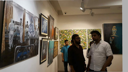
Artist Kaustav Mukherjee blogs are about fine arts for everyone to improve painting techniques through various painting tutorials and art discussions. Recently exhibited an exceptional Covid 19 painting.
Wednesday, June 7, 2023
Tuesday, August 30, 2022
How to Paint DETAIL | Part 3: COVID-19 PAINTING | SUGGESTIVE DETAIL
Saturday, June 4, 2022
Monday, May 9, 2022
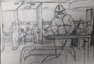
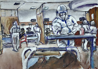
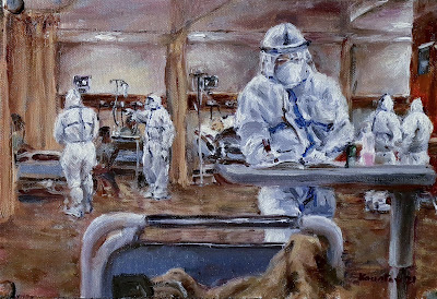
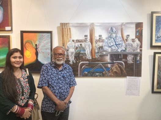
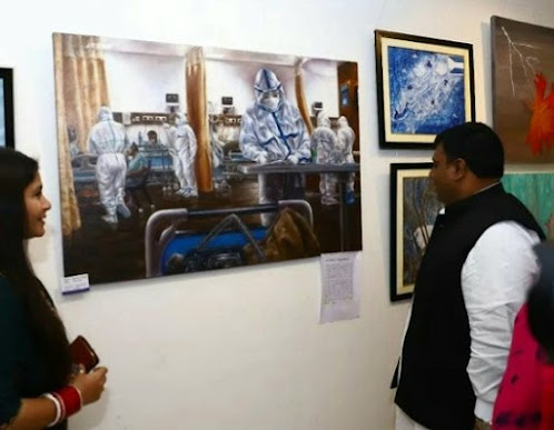
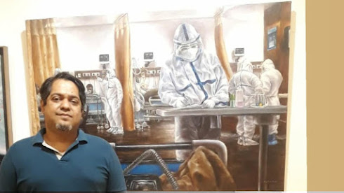
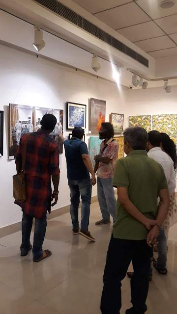
'A COVID ICU': A Covid 19 Painting - A 'REAL LIFE' Covid-19 ICU Room Experience
This big medical painting is in line with all the historic medical paintings done by past master artists such as Thomas Eikins, Rembrandt, Luciano Nezzo, Ugo Matania, Emma Mieville et al. This one-of-a-kind image is a depiction of a Covid ICU, where medics were busy at work despite all the dangers attached to it. There is no other known COVID painting in the world that involves first-hand experience of a Covid ICU and the situation. It shows the global crisis of this era in its actuality.
I conceived the idea when I was extremely ill with Coronavirus in July 2020. I could barely move my body on the bed and could not breath due severe pneumonia. It took me 22 days in the hospital to recover; during that time I planned the painting. I took the opportunity to create this medical painting to get an inside view of an ICU, treatment procedure etc. through taking numerous photo references, mobile app sketches of the doctor’s poses, equipment, treatment procedure, patients’ postures etc. The first draft of the painting itself was constructed while being in the ICU and later developed further after being released.
Even when the doctors were not sure about my situation, I found new strength (my wife recovered much earlier). I was thinking whether I could use my mind, eyes and hands to make that time useful and create something that would represent the time in which we lived.
I started drawing the medical people with mobile drawing apps, taking numerous photos of the ICU and started constructing the painting at that point. Poses were all taken from life while they were doing their dangerous job. This image is a depiction of a Covid ICU, where medics are busy with work without any sentimentality attached to it, caring for patients, working on the basis of data and observation.
Although this painting shows only the medical side, this is also a tribute to the ones who were involved in other fields, while they were at risk themselves!
Friday, March 29, 2019
Some Important Technical Point in Realism
- Values: without this realism will fail
- Abstraction: we don't see everything at the same time. We focus on one object and others become hazy slightly. So I don't emphasize unimportant things in a painting.
- Edges: Related to Values. But hard edges and soft edges define volume. Without this volume cannot be shown. Objects that obstruct the light will have an extremely bright edge. Objects upon which the light falls will have a paler outline. Some will fade into the background.
- Shape: As important as values, a mistake and the expression is lost.
- Feeling and intention: driving force, muse, motive behind the construction of a vision. Never lose sight of this.
- Planning: Do proper planning before painting. Don't just start with painting. Observe the source for a few days.
Monday, January 7, 2019
Choosing the Brushes
- Course support: Rougher brushes; paint slightly fluid (rough canvas surface; so bristle brushes)
- Smooth support: smoother brushes; paint slightly fluid (smoother panel surface; so soft nylon watercolor brushes)
- Arm Movement: Painting process remains similar but arm movement needs to be adjusted accordingly. Full arm movement for bigger size and full wrist movement at least for smaller size. Here the scale might have some impact on technique but as close one can get.
Monday, September 11, 2017
My Muted Color Palette
- Colors are commonly available, mostly series 1-2 colors. No fancy ones
- The paintings will be somewhat muted, not overpowering like my regular primary palette and different from a Zorn palette
- I can lighten the colors upto white and darken the colors down to black. No change here
- I can use colors that can be identified as red, blue, yellow and mixed ones purple, green, orange (I can live without the most accurate secondaries here)
- Reducing stress over correct color mixing. Focusing on values only
- Palette must be suitable for any muted subject
- White: Titanium White. I specifically did not look for a muted white because the colors need to be lightened to the highest degree
- Yellow: My choice is Yellow Ochre as it is a great muted yellows. I thought of using Raw Sienna and Naples Yellow, but they pose various challenges in color mixing. I can mix a color similar to Naples Yellow or Raw Sienna with Yellow Ochre
- Red: This was the toughest choice to make. I needed a muted slightly bluish red that can influence other colors. Obvious choices were the earth tones. Both Venetian and Indian red in Camlin brand are orangy. So not a good choice. But, I opened the tubes of the Light Red and Indian red. There was very little difference. I bought Indian Red, which has a color of very powerful rust. It produces muted purples/violets but I am still gonna try the Light Red color next time and see if it is slightly cooler. However, when mixed with yellow, Indian Red produces a vibrant orange
- Blue: I bought Indigo, which was more of a black with blue undertone. Other options being Ivory Black and Payne's Grey. I want this palette to be a distinct from Zorn Palette, therefore I won't add Ivory Black. Indigo serves the purpose greatly but I will also test Payne's Grey once and decide which one is better


